

用户被盗号了!为什么前端要被骂?
平时我们在浏览各种网站和 APP 的时候,都接触过密码这个东西~
密码设置的好不好,关乎到你的账号安全性,越复杂的密码越安全,所以密码强度很重要,而我们在做注册功能的时候,也有责任去帮协助用户设置一个高密码强度的密码~
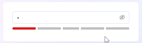
那么密码强度怎么计算呢? 且应该如何实现以下这样的密码强度动画展示效果呢?

其实思路很简单:
1、监听密码输入框的变化
2、密码变化时,获取密码文本,并通过某种方式计算这个密码的强度分数
3、根据强度分数,改变下方块的颜色和宽度
0分:强度低,红色,宽度 20%
1分:强度低,红色,宽度 40%
2分:强度中,橙色,宽度 60%
3分:强度高,绿色,宽度 80%
4分:强度高,绿色,宽度 100%

计算密码强度分数
用什么方式去计算密码强度方式呢?我们可以用 @zxcvbn-ts/core这个库来计算~
@zxcvbn-ts/core 是 zxcvbn 密码强度估计器的 TypeScript 实现版本,用于帮助开发者评估用户设置密码的复杂度和安全性,计算的依据有:
密码长度: 越长分数越高
字符类型: 数字、字母、符号
词典攻击检测: 内置词典列表,检测密码强度
评分系统: 0-4分,分数越高越安全
熵计算: 评测密码所需尝试次数,熵越高,分数越高
pnpm i @zxcvbn-ts/core
密码强度动画展示效果
计算了分数之后,我们需要根据分数去展示
不同的颜色
不同的宽度
我们可以使用属性选择器的方式,去完成这一个效果,看以下代码~
当密码改变的时候,会实时计算密码强度分数,这也就是意味着 data-score 这个属性会一直变,接着我们可以在样式中,去根据属性选择器去设置不同的颜色和宽度

现在可以看到这样的效果

完善动画效果
但是我们如果想实现分格的效果,可以借助伪元素去做~

现在可以达到我们期望的效果~

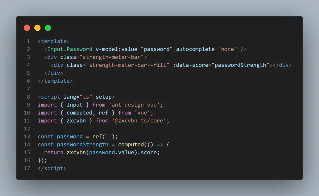
完整代码
<template>
  <Input.Password v-model:value="password" autocomplete="none" />
  <div class="strength-meter-bar">
    <div class="strength-meter-bar--fill" :data-score="passwordStrength"></div>
  </div>
</template>

<script lang="ts" setup>
import { Input } from 'ant-design-vue';
import { computed, ref } from 'vue';
import { zxcvbn } from '@zxcvbn-ts/core';

const password = ref('');
const passwordStrength = computed(() => {
  return zxcvbn(password.value).score;
});
</script>

<style lang="less">
.strength-meter-bar {
  position: relative;
  height: 6px;
  margin: 10px auto 6px;
  border-radius: 6px;
  background-color: rgb(0 0 0 / 25%);

  // 增加的伪元素样式代码
  &::before,
  &::after {
    content: '';
    display: block;
    position: absolute;
    z-index: 10;
    width: 20%;
    height: inherit;
    border-width: 0 5px;
    border-style: solid;
    border-color: #fff;
    background-color: transparent;
  }
  &::before {
    left: 20%;
  }
  &::after {
    right: 20%;
  }
  // 增加的伪元素样式代码

  &--fill {
    position: absolute;
    width: 0;
    height: inherit;
    transition:
      width 0.5s ease-in-out,
      background 0.25s;
    border-radius: inherit;
    background-color: transparent;

    &[data-score='0'] {
      width: 20%;
      background-color: darken(#e74242, 10%);
    }

    &[data-score='1'] {
      width: 40%;
      background-color: #e74242;
    }

    &[data-score='2'] {
      width: 60%;
      background-color: #efbd47;
    }

    &[data-score='3'] {
      width: 80%;
      background-color: fade(#55d187, 50%);
    }

    &[data-score='4'] {
      width: 100%;
      background-color: #55d187;
    }
  }
}
</style>
阅读建议
评论
匿名评论
隐私政策
你无需删除空行,直接评论以获取最佳展示效果